Building High-Quality Custom Property Editors for Flow
The configuration UX is the first thing an admin sees of your component — and the part most authors ship last. Here's how to build a Custom Property Editor that admins actually enjoy using.
You spent six weeks polishing the rendering. The component looks beautiful, the API is clean, the documentation is solid. An admin drags it onto a Flow screen, opens the configuration panel — and sees a textarea labeled Configuration JSON.
They close the tab.
This is the part most component authors get wrong. The component itself is half the deliverable. The other half is the configuration experience inside Flow Builder — the screen the admin actually touches. A great component with a bad Custom Property Editor (CPE) feels like a great car with a steering wheel made of rope. The mechanics work. Nobody wants to drive it.
Let's walk through how to build a CPE that earns the admin's trust in the first thirty seconds — and why most of that work isn't about features at all.
Chapter 01 · Foundations
What a Custom Property Editor Actually Is
Before we argue about UX, let's nail down the contract. A CPE is an LWC, you own the UI, Flow Builder owns the data — and there are exactly two flavors.
A Custom Property Editor is a Lightning Web Component that takes over the configuration panel for your action or screen component inside Flow Builder. Without one, Flow Builder generates a default form: one input per @api property, in declaration order, with no validation beyond data type. With one, you decide exactly what the admin sees, in what order, and under what conditions.
Before image: Flow Builder showing an auto-generated property panel for a screen component without a custom property editor
Default generated formCustom editor summary
Screenshot 01Drag the handle to compare Flow Builder's generated property form with a configured Visual Picker CPE summary. Same component slot, very different admin experience.
There are two flavors, and they're not interchangeable.
The two flavors:
Flavor
Targets
Used for
Action CPE
lightning__FlowActionEditor
Invocable Apex actions — the configuration shown when an admin drops your @InvocableMethod into a Flow
Screen Component CPE
lightning__FlowScreenAdditionalProperties
Screen components — extra configuration beyond the auto-generated property list
Table 01The two CPE targets. Pick the one that matches what your component is — they're not interchangeable.
You communicate with Flow Builder through a small contract: a getter/setter pair for inputVariables, an optional setter for genericTypeMappings, and a single custom event — configuration_editor_input_value_changed — that you fire whenever the admin changes something. That contract has not changed in years. What's changed is the room you have to work in.
Chapter 02 · Real Estate
Know Your Real Estate
The right-side panel is roughly 320 pixels wide. That's a hard constraint, not a styling suggestion. Most CPEs ignore it. The fix is structural.
The right-side configuration panel in Flow Builder is roughly 320 pixels wide. That's not a guess — it's a hard constraint your CPE inherits the moment it loads. A <lightning-input> field with a label takes about a third of the vertical space you have above the fold. A two-column layout barely fits. A data table doesn't fit at all.
This is where most CPEs fall apart: authors try to cram every configuration option into the panel because the panel is what they see during development. Then a real admin opens it and discovers a vertical canyon of inputs, scrolling for a minute, with no sense of where the important fields are.
The fix is structural, not visual: at a certain complexity threshold, stop fighting the panel and launch a modal.
Anti-pattern
Inline / Cramped
Every input crammed into 320px. Validation hidden below the fold. Admins scroll, get lost, and close the tab.
Configure Component
Component Label*
My Datatable
Source Records*
{!Account_Records}
Display Mode
Compact
Columns (JSON)*
[{"field":"Name"...
Sort Field
Sort Direction
ASC
Filter Expression
Page Size
25
Allow Selection
false
Allow Edit
false
14 more fields below
Columns (JSON) must be valid JSON
The right pattern
Modal Launcher
One labeled button. A summary line in human language. Open the modal only when there's work to do.
Configure Component
Component Label*
My Datatable
Datatable Configuration
Currently configured
8 columns
Sorted by Name DESC
Filtered to active records
Inline edit enabled
Allow Multi-Select
false
Both panels are 320px wide. One drowns the admin in inputs.·The other communicates state and gets out of the way.
The pattern on the right is straightforward: render a single button in the inline panel ("Configure datatable…"), and on click open an overlay using the lightning/overlayUtils module or a <c-fsc_modal>-style component. The modal is your UI — full-screen real estate, full-width tables, side-by-side column layouts, real space to breathe.
That single button should make the current configuration state legible at a glance. Show a tiny summary block — "8 columns, sorted by Name" — so the admin doesn't have to open the modal just to remember what they configured last week.
Chapter 03 · The Toolkit
Use Flow Resource Pickers, Not Plain Inputs
The single most common CPE mistake — and the one admins notice first — is using a plain text box for a value that could be a Flow resource.
Here's the scenario. Your action has a recordId input. You drop a <lightning-input type="text" label="Record ID" /> into your CPE. An admin tries to bind it to {!recordOutput.Id} from a previous Get Records element. They type the merge field syntax. Flow Builder saves it as a literal string. The Flow runs, the action receives the literal text {!recordOutput.Id}, and the integration silently fails.
A native Flow input would have offered them a resource picker — a dropdown that shows variables, formulas, constants, and merge fields available in the current Flow scope. Your CPE skipped that affordance, and the admin is in a debugging session that has nothing to do with their Flow logic.
The rule of thumb: if the input could ever hold a Flow resource, give the admin a resource picker. A text input is for free-text labels and headings. Everything else — record IDs, field references, dynamic strings, numeric values that might be calculated — gets a picker. The five-minute investment to swap inputs becomes the difference between "this feels like a Salesforce action" and "this feels like a third-party form."
On guided UX
Six Principles
A CPE is not a settings page. It's a conversation between you and an admin trying to ship a Flow this afternoon. These are the six tells that separate a thoughtful CPE from a form that thinks it's documentation.
01
Principle I
Progressive disclosure
Don't show every option at once. Start with the inputs that must be set, hide the rest behind an "Advanced" toggle or a second tab. The admin completes the basics, sees the component start working, and only opens the advanced section when they hit a real need.
02
Principle II
Smart defaults
Every input should have the most common useful value prefilled. "Sort ascending" beats blank. A reasonable date format beats no format. The admin's job is to override defaults that don't fit, not to invent values from scratch.
03
Principle III
Contextual help
Help text belongs next to the field it explains, not in a footnote, not in external documentation. Use the field-level-help slot of <lightning-input> for short hints. Use a small <lightning-helptext> icon for longer guidance.
04
Principle IV
Validation that teaches
"Invalid input" is a failed conversation. "Field API names are case-sensitive — try Account.Name instead of account.name" is the same validation, written for a human. Your error messages are documentation that only fires when relevant.
05
Principle V
Show consequences
When the admin picks an option that changes downstream behavior — say, switching from single-select to multi-select — render the consequence immediately. A small preview, a label change, a hint. Decisions made blind get reversed under support pressure.
06
Principle VI
Save state legibly
A configured component should look configured. In the inline panel, show a one-line summary of the current state. In a modal, show a "what's changed" indicator so the admin knows whether their unsaved edits will stick.
The honest test: ask a coworker who has never seen your component to configure it for a realistic use case, without giving them any context. Watch what they hover, what they read, what they click first, where they pause. The first three places they pause are your highest-leverage UX bugs.
Chapter 04 · Patterns
A Pattern That Works: The Modal Wizard
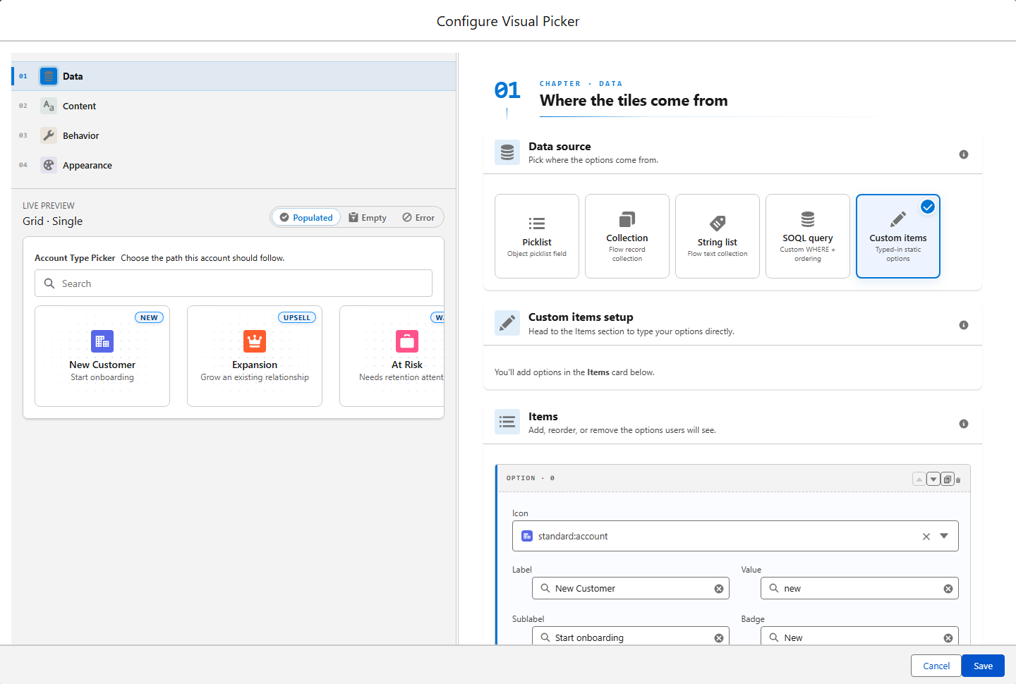
For complex CPEs — anything with conditional inputs, mappings, or previews — the modal wizard is the most reliably good shape. Here's the recipe.
Screenshot 02The Visual Picker CPE launches a real configuration workspace: source selection, live preview, editable items, and save/cancel controls in one focused modal.
1
Inline panel: launcher + summary
Render only two things in the right-side panel: a primary button (Configure datatable…) and a one-line summary of the current state (8 columns · Sorted by Name DESC · Filtered to active records). Nothing else. The panel's job is to communicate "this is configured, click here to change it."
2
Modal: full-screen, sized for the work
On click, open a modal at a comfortable size — typically 720–960px wide, autosize on tall content. Use lightning/overlayUtils for the official path, or a community modal LWC if your org standardizes on one. The modal owns the configuration UX entirely.
3
Inside the modal: tabs or steps for grouping
Group inputs by intent. Tabs work well for independent groups (Columns, Sorting, Filtering, Behavior). Steps work well for dependent groups where the admin can't pick step 3 without finishing step 1 (e.g., pick sObject → map fields → set defaults). Don't mix the two patterns in the same modal.
4
Live validation, no submit-and-pray
Validate as the admin types. Disable the Save button until the configuration is internally consistent. Show what's missing in plain language above the Save button: "Add at least one column to save." Submit-and-pray ("click Save, see what breaks") is the pattern admins associate with bad enterprise software.
5
Save: fire the change event, close, update summary
On Save, fire a single configuration_editor_input_value_changed event for each modified input. Close the modal. The inline panel's summary line updates to reflect the new state. The admin sees their decision reflected back without leaving Flow Builder.
6
Cancel: discard cleanly
Cancel must throw away the modal's local state and not fire any change events. Sounds obvious — half the CPEs out there fire a flurry of input-changed events on close because someone forgot to gate them behind the Save button. Test the cancel path explicitly.
This pattern scales. A datatable CPE, a row-action mapper, a multi-step picker for an Apex action — all the same shape. The shape becomes muscle memory both for you and for the admins who use multiple components from your library.
Chapter 05 · Anti-patterns
What Newton Sees Most Often
Five mistakes show up in nearly every CPE review. Each one is a five-minute fix. Each one decides whether an admin trusts your component.
01
Anti-pattern 01
Plain text inputs where a resource picker belongs
Don't
<lightning-input type="text" label="Record ID" /> for a value the admin will obviously want to bind to {!recordVar.Id}. The literal string saves, the Flow runs, the integration silently fails.
Do
<lightning-flow-combobox> (or the community c-fsc_flow-combobox) for any value that could hold a Flow resource. Plain inputs are reserved for free-text labels — period.
02
Anti-pattern 02
Showing API names instead of human labels
Don't
A field labeled enableMultiSelectMode__c. A picklist value of OPT_A. These are labels for you, the developer — they leak straight into the admin's face.
Do
Translate every label that crosses the developer/admin boundary. "Allow multiple selections." "Detailed view." Names admins can read aloud without flinching.
03
Anti-pattern 03
Required fields with no visual marker
Don't
Validation that fires only on Save and points at three fields the admin didn't know were mandatory. The fastest way to lose trust on the first interaction.
Do
Mark required fields with the asterisk and the required attribute on <lightning-input>. Validate as the admin types. Errors render under the offending field, not in a banner three sections away.
04
Anti-pattern 04
Modals that scroll horizontally
Don't
A horizontal scrollbar inside a modal. A table that overflows the dialog. Layouts that assume a 1600px monitor. All three are the same bug wearing different costumes.
Do
Constrain to 720–960px and scroll vertically when content grows. Tables get column groups, master-detail layouts, or pagination. Test at 1280px wide — if it breaks there, it'll break in production.
05
Anti-pattern 05
No state summary in the inline panel
Don't
After the admin closes the modal, the inline panel reverts to the same launcher button with no indication of what's configured. They re-open the modal every time, just to remember.
Do
Show a two-line summary in human language. "8 columns. Sorted by Name. Inline edit on." The cheapest UX upgrade you can ship — five lines of code, hours of admin time saved.
Chapter 06 · Ship It
A Pre-Flight Checklist Before You Ship
Before you tag a release of any component or action with a CPE, walk through this list. None of these are theoretical — every one comes from a real CPE that shipped and broke an admin's afternoon.
Check
What to verify
Resource pickers everywhere they belong
No <lightning-input> on a field that could accept a Flow variable, merge field, or formula
Required fields marked visually
The asterisk is visible, the validation fires before Save, the error message is human-readable
Smart defaults set
Every input that has a "common case" value comes prefilled with it
Help text in context
Every non-obvious field has a one-line hint or a help icon — not in external docs
Modal threshold checked
If the inline panel scrolls past one screen, you've crossed the threshold — refactor to a modal
Cancel path tested
Closing the modal without saving fires zero input-changed events and discards local state
Inline summary line
After save, the panel shows a one-line summary of the configured state in human language
Error states styled
Validation errors render in destructive red with the exact field highlighted, not a generic banner
Light mode tested
The CPE renders in Flow Builder, which is light mode by default — no dark-mode-only assumptions
Real admin tested
Someone who has never seen your component configured it cold without context. You watched.
ChecklistRun this list before every release. The last item is the most-skipped and the highest-leverage.
The last item is the most-skipped and the highest-leverage. Every component author thinks their CPE is intuitive because they wrote it. The first cold-eyes test always surfaces a label that's confusing, a default that's wrong, an input order that's reversed. Schedule it before the package is signed.
Summer '26 brings three small improvements that meaningfully change how you can structure CPEs for invocable actions specifically. None of them require a rewrite — they just give you better building blocks.
The honest implication: if you ship invocable actions, plan a v3.x release that adopts these. The configuration UX of every action you've shipped is about to be revisited, and admins will feel the difference.
You don't have to build every CPE pattern from scratch. The community has done a lot of the hard work, and the docs cover the contract precisely. Read three before you write your own. Keep the patterns that work. Skip the patterns that don't.
Worth borrowing
The Reference Shelf
Three resources to read before you write a single line of CPE code. The first one is the de-facto base pack. The second is the canonical example of a complex screen-component CPE. The third is the source of truth for the contract itself.
The last thing worth saying: the admin who configures your component is the most important user you have. They decide whether your action survives the Flow review, whether your screen component goes into the org's standard pattern library, whether the next admin in the org learns to trust your work. The configuration UX is not the final 5% of polish. It's the first 30 seconds of the admin's relationship with your component.
Ship it like that.
Closing
The CPE Is the Component
A great Custom Property Editor is the sound of a thousand small decisions that an admin will never explicitly notice. The right field type. The smart default. The picker instead of the textbox. The modal instead of the cramped panel. The summary line that reminds them what they configured last Tuesday.
Get those decisions right and the admin opens your component, configures it in two minutes, and moves on. Get them wrong and they spend forty minutes wrestling with a form that thinks it's documentation.
The configuration UX is not the wrapper around your component. It is your component, as far as the admin is concerned. Build it like you'd want to use it.